The graph became a resume it was never built to be
Open almost any developer's GitHub profile and the first thing you see is the grid of green squares. Somewhere along the way it stopped being a casual activity view and became an unofficial resume, the thing people glance at to judge whether someone is a "real" or "active" developer. That is a lot of weight to put on a chart that was never designed to carry it.
Quick Answer
GitHub's green squares show that activity happened, not that meaningful work got done, and not that the work was yours. The contribution graph counts commits, and a commit is a unit of version control, not a unit of effort or impact. Fifty "fix typo" commits light up more squares than three commits that shipped a hard feature. The graph also ignores everything that never becomes a commit, and it can be padded or automated. Below is what the graph actually measures, what it hides, why people game it, and what counts as real proof of your work instead.
The graph measures one thing: that you pushed commits on a given day. It says nothing about what those commits were, whether they mattered, or whether you wrote them. Once a signal like that becomes a status symbol, two things happen at once. People start optimising for it, and people start trusting it more than it deserves. Both are problems, and together they make the graph a worse signal every year, not a better one.
This matters because the gap between looking active and being effective is exactly where bad hiring decisions and bad self-assessments live. If you are judging yourself or a candidate by square density, you are measuring the thing that is easiest to fake and least connected to value.
The commit-count fallacy
A commit is a checkpoint in version control. It is not a measure of effort, difficulty, or impact, and treating it as one produces nonsense rankings. A developer who breaks work into fifty tiny commits will out-green a developer who ships a major feature in three clean ones, even though the second did the harder, more valuable work. The metric rewards frequency, which is the one property of good engineering that does not actually matter.
Once you see that, the graph's authority falls apart. It is not measuring productivity badly, it is measuring something else entirely and being read as productivity. In practice this means the greenest profile in a stack of candidates is often just the one with the most granular commit habit, which tells you nothing useful about who to hire.
What the graph quietly leaves out
The deeper problem is everything the contribution graph cannot see. A huge share of real engineering work never becomes a public commit, so the graph is blind to it by design. If you have ever had a brutal week of work and a sparse-looking graph, this is why.
The graph does not show:
- Time spent thinking, designing, and planning before any code exists
- Code review, mentoring, and collaboration
- Debugging sessions that end in a one-line fix or no commit at all
- Documentation and knowledge sharing
- Work in private or company repositories
- The actual impact of what was shipped
This is also where AI changes things. More work now happens in terminal and agentic sessions, where the thinking and direction you provide may land as a few large commits or as work an editor never witnessed. The graph flattens all of that into the same green square it gives a typo fix. The texture that actually distinguishes strong work from busywork is exactly the texture it throws away.
Why people game it, and why that breaks the signal
Because the graph is visible and treated as a credential, it creates the incentive any visible metric creates: optimise the metric, not the work. Some developers commit constantly to protect a streak. Others script commits to keep the grid green on days they did nothing. None of this is exotic, and all of it is undetectable from the graph itself.
This is the quiet reason the green graph cannot be trusted as proof. A signal anyone can inflate without doing the underlying work is not evidence, it is decoration. The moment a metric becomes a goal, it stops measuring the thing it used to correlate with, and the contribution graph crossed that line years ago. You simply cannot tell a padded graph from a real one by looking, which means you cannot rely on it to tell you anything.
What actually proves your work
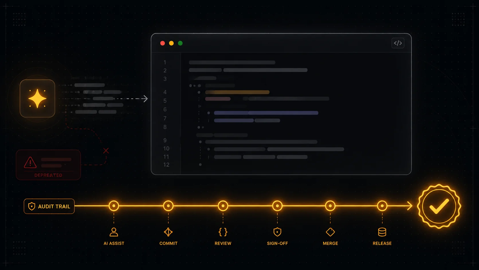
If the graph is a claim wearing the costume of evidence, the obvious question is what real proof looks like. The difference is verifiability. Real proof is an audited record of what you shipped, traceable back to the source, built up over time, and ideally attributable to you rather than to an agent. It survives someone checking it without your help, which is the one thing a green square cannot do.
This is the reframe worth holding onto: it is a proof problem, not a profile problem. A nicer-looking graph is still a claim. An auditable trail of real work is evidence. The first collapses the moment someone doubts you; the second was built for that moment. For the full version of this argument, see prove what you shipped, and for the practical mechanics, how to verify GitHub contributions.
Where DevClocked fits
DevClocked exists to replace the green square with something that holds up. It tracks the real work behind the graph, including the editor, terminal, and agentic sessions the graph never sees, and builds a record audited to source that shows what you actually shipped over time. The point is not a prettier chart. It is a record someone skeptical can follow back to where the work happened.
It is worth being honest about the limits. If all you want is a quick vanity view of your own activity, the native GitHub graph is free and right there. And no tracker can manufacture work that does not exist, so this only helps if there is real work to show. DevClocked earns its place when you are tired of genuine effort being invisible on a graph that rewards the wrong thing, and you want proof that does not depend on anyone trusting the squares.
Related Guides
- Prove what you shipped: the claims-versus-proof case in full.
- How to verify GitHub contributions: checking the real record behind the graph.
- How to prove you wrote the code: authorship and provenance in the AI era.
- How to track coding time from git: building an audited trail of real work.